Client
The Client is a public college located in Toronto, Canada. It offers full-time and part-time programs at the degree, diploma and certificate programs levels.
Challenges
The client wanted us to build dashboards for their college website traffic data and they are using Google Analytics to track their college website traffic. Client wants the dashboards for College Faculty and Marketing Team. As both Faculty members and Marketing team does not have much knowledge about Google Analytics and Website performance metrics, the client wants more visualisation on dashboard so that their target audience can understand the data in a better way. In addition to this, Client also want to see data for any time period having trends for monthly, weekly & daily periods.
Solutions
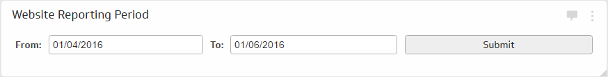
We first analyzed the client's requirement and find out the Key Performance Indicators, what metric they really want to show on dashboard for faculty and Marketing team. We then created some sample mock ups for faculty and Marketing Team accordingly and showed them to clients to find out their visual preferences. When we finalize the Klips/Dashboard layout and design, we initiated the development work. As the Client want to see data for any time period, we build a custom date range selector which allows them to select any date range. The date range filter have two date picker elements to select the start and end date.
We then created two variables for this, one start_date and one for end_date and created dynamic data sources as per the Klip data using the standard google analytics connector, so that the dashboard will show data for the selected time period. We then build the dashboard/Klips as per the decided mock ups and successfully build the required dashboards.
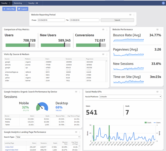
Faculty Dashboard
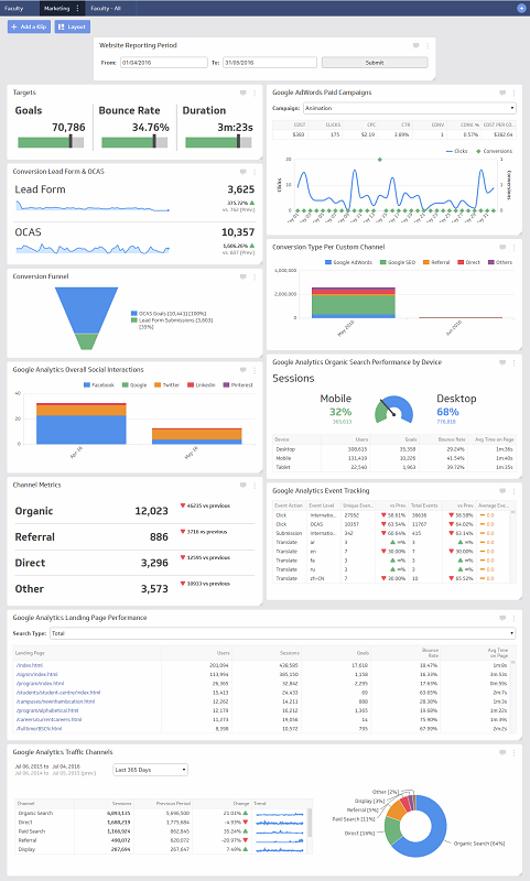
Marketing Dashboard
Results
We successfully build the Faculty & Marketing Dashboards, having following benefits:
The dashboards helps the client in various ways as they provide a quick overview, often with charts and graphs, allowing busy individuals to quickly take in the necessary information and make appropriate decisions as graphical representation make strategic data easy to understand.
Faculty Members easily tracks the website performance, as the dashboard focuses users on information about the indicators judged as the most important to the organization. The Key Performance Indicators shown in the Faculty dashbaord are: traffic sources, sessions, Bounce Rate, time on site, conversions etc.
Marketing team makes decisions by comparing the organization's performance with predetermined benchmarks. Marketing Dashboard helps them to analyze and gain greater insight into organization’s key performance indicators (KPIs). The Key Performance Indicators shown in the Faculty dashbaord are: traffic sources, sessions, Bounce Rate, time on site, conversions, top landing pages, content-interactions, events, paid & organic searches, search by device etc.