Google Analytics provide a lot of useful data related to our website like users, sessions, new users, pageviews/session, session duration, channels through which users are coming, regions from where we are getting maximum hits
and a lot more. By using this data we can know boost our business.
But how to convert this data into useful information? Yes you are right, by using
Salesforce Einstein Analytics.
Salesforce Einstein Analytics(Wave Analytics)
is a new cloud-based analytics tool that help in creating powerful Chart and Dashboards using your large of data. Einstein Analytics allows you to bring in data from your Salesforce orgs, as well as from your external sources. Data preparation toolsprovided by the Einstein Analytics allow you to easily manipulate and clean your data. By developing the Dashboard from this data you can see your progress.
We have made charts in Einstein Analytics on Google Analytics Data.
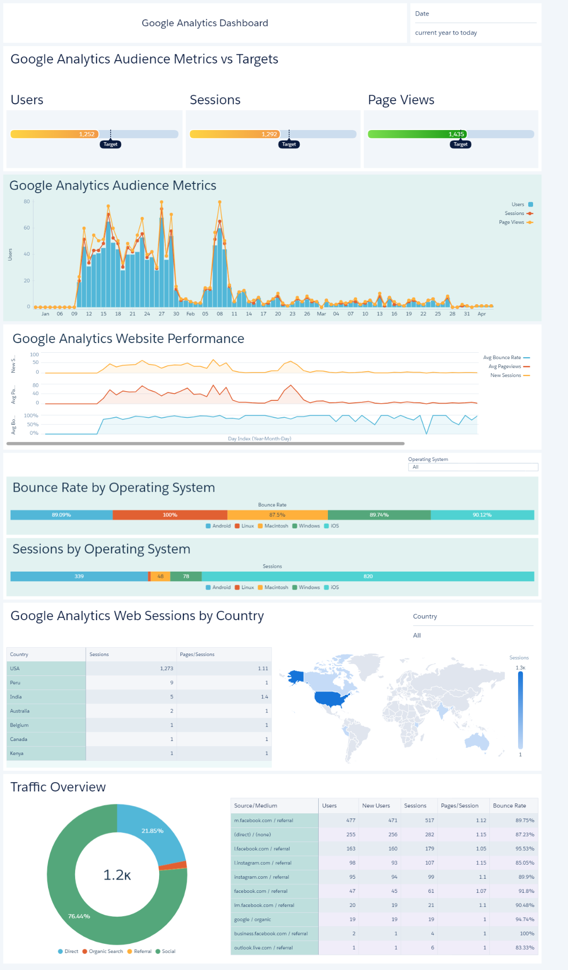
The client had a requirement to develop a Google Analytics Dashboard on Einstein Analytics. So we developed the following charts:
While Google Analytics provides insights into website visitors and engagement, combining this data with CRM-based lead analytics can provide a complete picture of customer acquisition. Lead dashboards in Salesforce help track lead sources, conversion rates, and engagement trends, enabling businesses to align marketing efforts with sales outcomes.
-
Google Analytics Audience Metrics vs Targets:
For this Flat Gauge Chart we used user, session and pageviews metrics from Google Dashboards.
User metrics: The number of users who have at least one session on your website.
Session metric: How many time a user was actively engaged in your website.
Pageviews metric: Total number of pages viewed by the users on your website. The chart below shows the comparative result of these metrics vs the targets.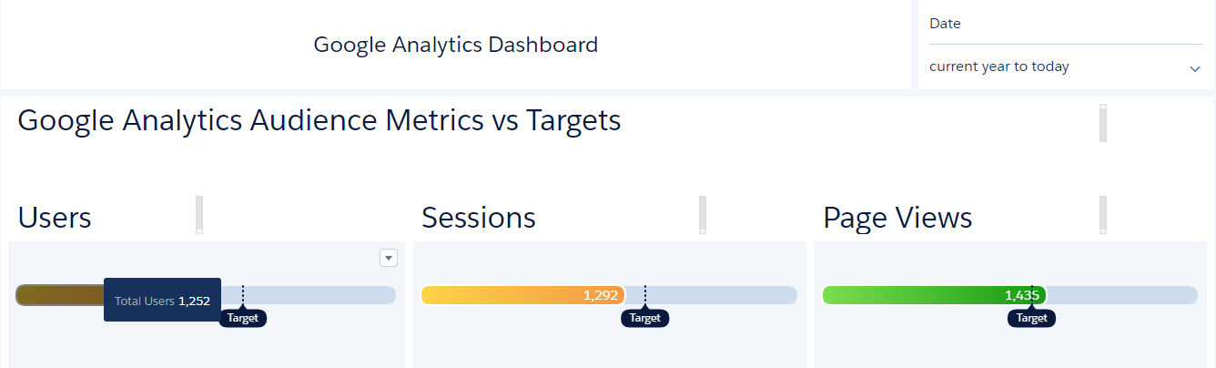
-
Google Analytics Audience Metrics:
Same metrics are used in this Time Combo Chart as in previous chart but it’s displaying date wise data. On the axis we have shown the Date Index. By hovering over the bar of this chart, we can see the users, sessions and pageviews on that specific date

-
Google Analytics Website Performance:
The following Line Chart displays the Website Performance based on average of
bounce rate, pageviews and new session metrics.
Bounce Rate: It tells about the percent of visits which are single page only.
New Sessions: The number of new users who visited your website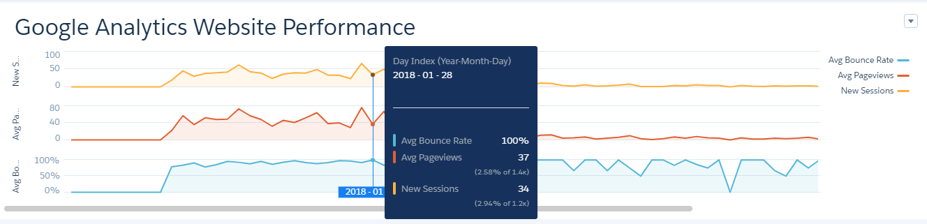
-
Google Analytics Web Sessions:
The Compare Table and Map Widget shown below displays the regions from where
the users are visiting our website.
We have used filter on the Country to get the result only from the India.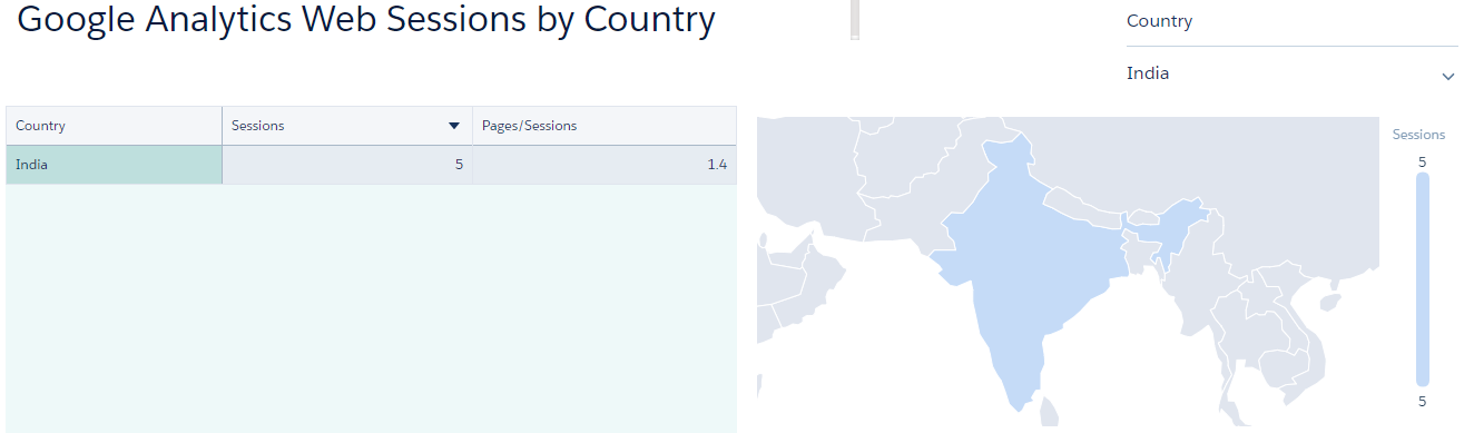
-
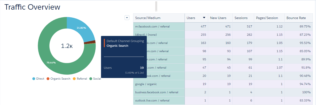
Traffic Overview:
We have used two widgets, Donut and Compare Table to show the information related to the Traffic. Donut Chart shows the Channels through which traffic is coming to our site. There are mainly four sources of the traffic which are given below:
Beyond analyzing traffic sources and engagement, businesses can extend their analytics to track how website interactions translate into revenue. Opportunity dashboards provide insights into sales pipeline performance, revenue trends, and deal progression, helping organizations measure the true impact of marketing efforts.
- Direct Traffic : The visitors, who are directly coming to your website from their browsers by typing URL or using Bookmark.
- Organic Traffic: The visitors, who are coming through the search engine.
- Referral Traffic: The visitors, who are coming to your website via another website which has linked to you.
- Social Traffic: The visitors, who are coming from social media network.
Compare Table is showing the the detailed information of the source/medium.
-
Other Information:
Google Analytics gives a lot more data like OS used by the visitors. This information can be fruitful while changing layout or creating the new layout of your website.
The following Flat Gauge Chart shows the Bounce Rate by Operating System.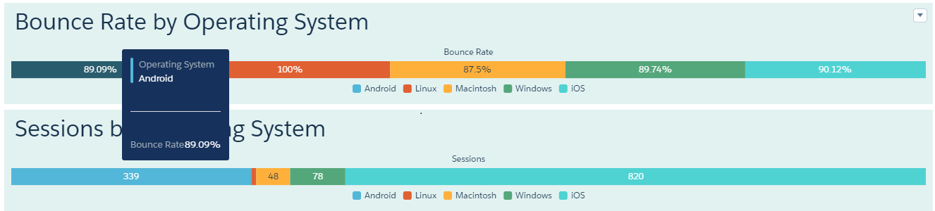
The Image shown below is the complete visualization of the GA Dashboard on Einstein Analytics. The data of the Dashboard changes according to the filter applied on it. We can add filters based on any data field like we have used the Date field at the top of the Dashboard and another filter which is inside the chart Google Analytics Web Sessions.
To further enhance dashboard usability and performance, Salesforce CRM Analytics allows dashboards to be divided into multiple pages, each focusing on a specific dataset or audience. This improves navigation, reduces load time, and enhances user experience while analyzing complex Google Analytics data.
The real power of CRM Analytics lies in its ability to integrate data from multiple sources, including Google Analytics and Salesforce CRM. This integration ensures that businesses can analyze customer journeys from website interaction to final conversion in a unified view. A well-integrated system helps improve decision-making and campaign effectiveness. To learn more about integration capabilities, refer to our article CRM Analytics Salesforce Integration page.
For any query on Google Analytics Dashboard On Einstein Analytics, contact support@astreait.com