Tableau is a Business Intelligence tool that enables you to create interactive and attractive visualizations in the form of dashboards and worksheets which is collectively said as workbook, to gain Business insights for the better development of your company. It allows non-technical users to easily create customized dashboards that provide insight to a broad spectrum of information.
Tableau dashboards are widely used to analyze data from different Salesforce objects such as Cases, Opportunities, and Accounts. By connecting Salesforce with Tableau, organizations can build interactive dashboards that provide deep insights into sales performance, pipeline trends, and customer interactions. These dashboards help business leaders make informed decisions based on real-time CRM data.
In addition to sales and opportunity analysis, organizations also use Tableau to visualize customer service and support data from Salesforce. By connecting Tableau with Salesforce Case objects, businesses can monitor case volumes, response times, resolution performance, and support team productivity through interactive dashboards. These insights help service teams improve operational efficiency and enhance customer satisfaction.
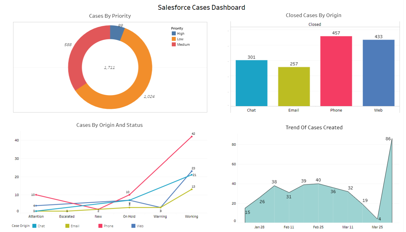
Astrea has extensive expertise on building Salesforce charts in Tableau. The blog illustrates a few charts displayed in Tableau for the standard Case object.
Following are a few examples of charts on Tableau dashboard for ‘Salesforce Cases”:
-
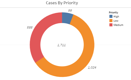
Case By Priority: The Donut Chart shows the total number of records according to priority. The total number of records calculated as per the following 3 priorities:
- High Priority
- Medium Priority
- Low Priority
-
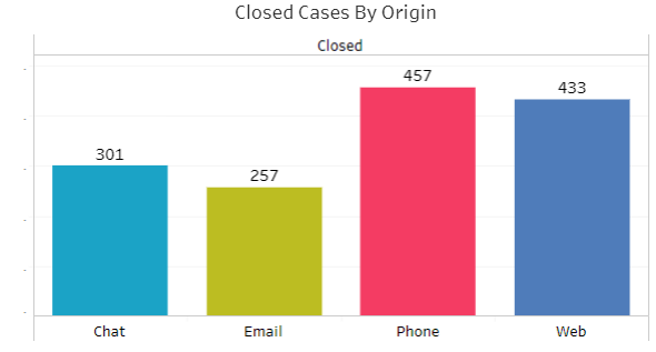
Closed Cases By Origin: The Bar Chart shows the number of cases of by closed status according to case origin. The case origin are:
- Chat
- Web
-
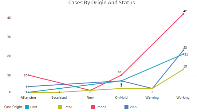
Cases By Origin And Status: The Line Chart shows the number of cases by status according to origin. The following status are:
- Attention
- Escalated
- On Hold
- Warning
- Working
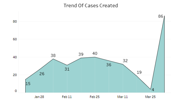
- Trend Of Cases Created: The Area Chart shows the created cases by open date weekly.
Below is the whole visualization of the dashboard “Salesforce Case Dashboard”.
In addition to CRM and customer service analytics, Tableau is also commonly used to analyze digital advertising campaign performance. Businesses can track advertising metrics such as impressions, clicks, cost per click (CPC), and conversion rates through interactive dashboards. These insights help marketing teams evaluate campaign effectiveness and optimize advertising strategies.
Summary:
Organizations often complement their CRM and service analytics with website traffic and user behavior insights from Google Analytics By integrating Google Analytics data with Tableau dashboards, businesses can monitor website engagement, traffic sources, and marketing performance. This combined analysis provides a holistic view of customer interactions across digital channels.
Tableau continues to play a critical role in modern business intelligence by enabling organizations to transform complex datasets into meaningful insights. From Salesforce service analytics and sales dashboards to marketing performance tracking and website analytics, Tableau helps businesses make data-driven decisions across departments. To explore more Tableau dashboards, analytics solutions, and real-world use cases, visit our Tableau Analytics Expertise Page.
For any query on Tableau Salesforce Case Dashboard, contact support@astreait.com