Salesforce Einstein Analytics(Wave Analytics) is a new cloud based analytic tool which helps in creating powerful Reports and Dashboards from large amount of enterprise data. Also, Wave Analytics enables anyone to get immediate access to powerful data insights through its point-and-click visual interface of your org. Einstein Analytics allows you to bring in data from your Salesforce orgs, as well as from your external sources. A user could get instant visualizations that show how your business is doing.
We have made some advanced charts in Einstein's Analytics on Salesforce Standard Object- Lead.
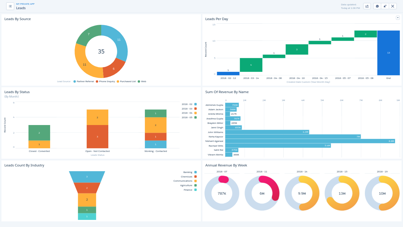
Following are charts on Wave Analytics dashboard “Salesforce Lead Dashboard”:
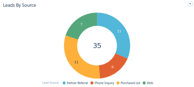
- Leads By Source: The Donut chart shows the count of Leads according to the Source. Leads are counted as per the following of 4 Lead Source:
- Partner Referral
- Phone Inquiry
- Purchased Lis
- Web
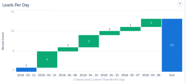
- Leads Per Day: The Waterflow chart shows the number of Leads per day. Last column “End” adds up the Leads and shows total number of Leads.
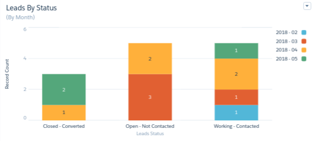
- Leads By Status: The Stacked column chart shows the count of Leads per month according to Status. The Leads are counted on the basis of 3 following Status:
- Closed - Converted
- Open - Not Contacted
- Working - Contacted.
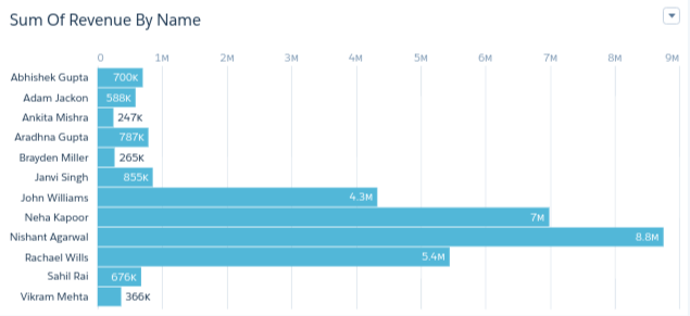
- While this dashboard focuses on Lead data, similar analytics can also be applied to other Salesforce objects such as Opportunities to gain insights into revenue, pipeline stages, and deal performance. Opportunity dashboards provide deeper visibility into sales forecasting and conversion trends. Sum Of Revenue By Name: The Bar graph shows the sum of Annual Revenue of leads by their full name.
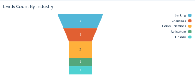
- Leads Count By Industry: The Funnel chart shows the count of Leads per month according to Industry. Filter has been applied on Industry that’s why this chart is showing a limited number of Industry. Following are the 5 Industries for which leads are counted:
- Banking
- Chemicals
- Communications
- Agriculture
- Finance
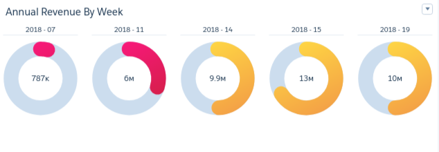
- Annual Revenue By Week: The Polar gauges shows Annual Revenue of Leads per week. Revenue has been calculated weekly and numbered corresponding to the start date of the year. For example, the first gauge shows total revenue of 7th week of year 2018 i.e. dates between 11/02/2018 to 17/02/2018.
Below is the whole visualization of the dashboard “Salesforce Lead Dashboard”. The data in all the widgets of the dashboard changes even on clicking any part of a widget. For example, clicking on the bar of any barchart the respective data of all the widgets in the whole dashboard changes
CRM Analytics is not limited to Salesforce data alone; it can also integrate and visualize external data sources such as website analytics. For example, Google Analytics dashboards can be built within Einstein Analytics to analyze website traffic, user behavior, and marketing performance alongside CRM data.
High-performance dashboards rely on well-integrated and comprehensive datasets. CRM Analytics enables seamless integration between Salesforce and external systems, ensuring that dashboards provide a unified and accurate view of business data. This integration plays a critical role in building scalable and insightful dashboards. To understand more about integration capabilities, refer to our article CRM Analytics Salesforce Integration page.
For any query on Salesforce Lead Dashboard On Einstein's Analytics, contact support@astreait.com