Tableau is a powerful and fastest growing data visualization tool used in the BI industry that is helpful in transforming raw data into very easy to understand format for everyone. Tableau allows users to create Data visualizations in the form of ‘Dashboards’ and ‘Worksheets’ and provides a quick analysis. The resulting information from the data using Tableau can be easily understood by all professionals in an organization.
In addition to sales and opportunity analysis, organizations also use Tableau to visualize customer service and support data from Salesforce . By connecting Tableau with Salesforce Case objects, businesses can monitor case volumes, response times, resolution performance, and support team productivity through interactive dashboards. These insights help service teams improve operational efficiency and enhance customer satisfaction.
It enables any non-technical user to create a customized dashboard with its easy to use design. The best feature Tableau are,
- Data Blending
- Real Time Analysis
- Collaboration Of Data
Astrea has developed advanced charts in Tableau on Salesforce Standard Object- Opportunity and Account. The article below displays a few Tableau dashboard for the standard objects Opportunity and Account:
- Opportunity Amount By Month- The Bar Chart shows the opportunities amount month-wise.

-
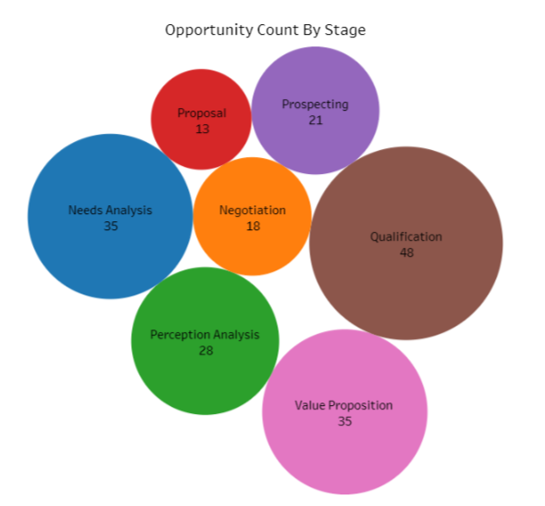
Opportunity Count By Stage- The Packed Bubble Chart shows opportunity count according to stage. Packed bubble charts are used to display data in a cluster of circles.
The opportunities are counted as per following of 7 stage:
- Qualification
- Need Analysis
- Negotiation
- Proposal
- Value Proposition
- Perception Analysis
- Prospecting
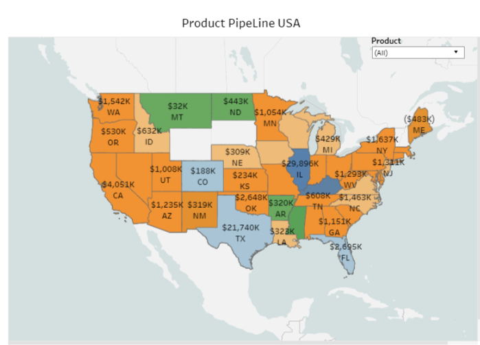
- Product Pipeline USA- The Map Chart shows the number of products according to state with specifying product filter.
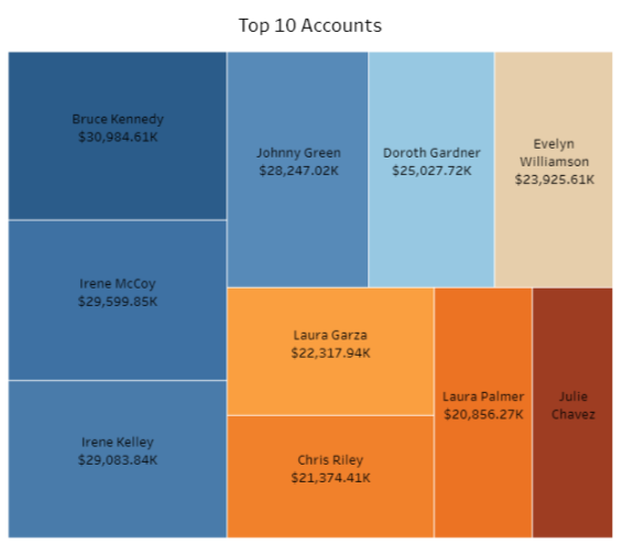
- Top 10 Accounts- The Treemap Chart shows the top 10 accounts and owner names according to amount.
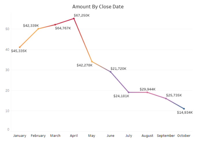
- Amount By Close Date- The Line Chart shows the number of accounts according to close date(Month-wise).
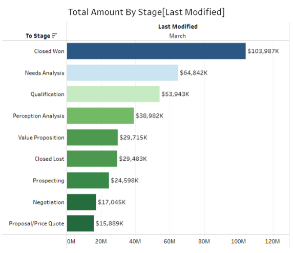
- Total Amount By Stage [Last Modified]- The Horizontal Bar Chart shows the total amount by stage with the help of last modified dates.
The image below gives the complete visualization of the dashboard called “Salesforce Dashboard”. All the widgets of the dashboard displays the data from the different
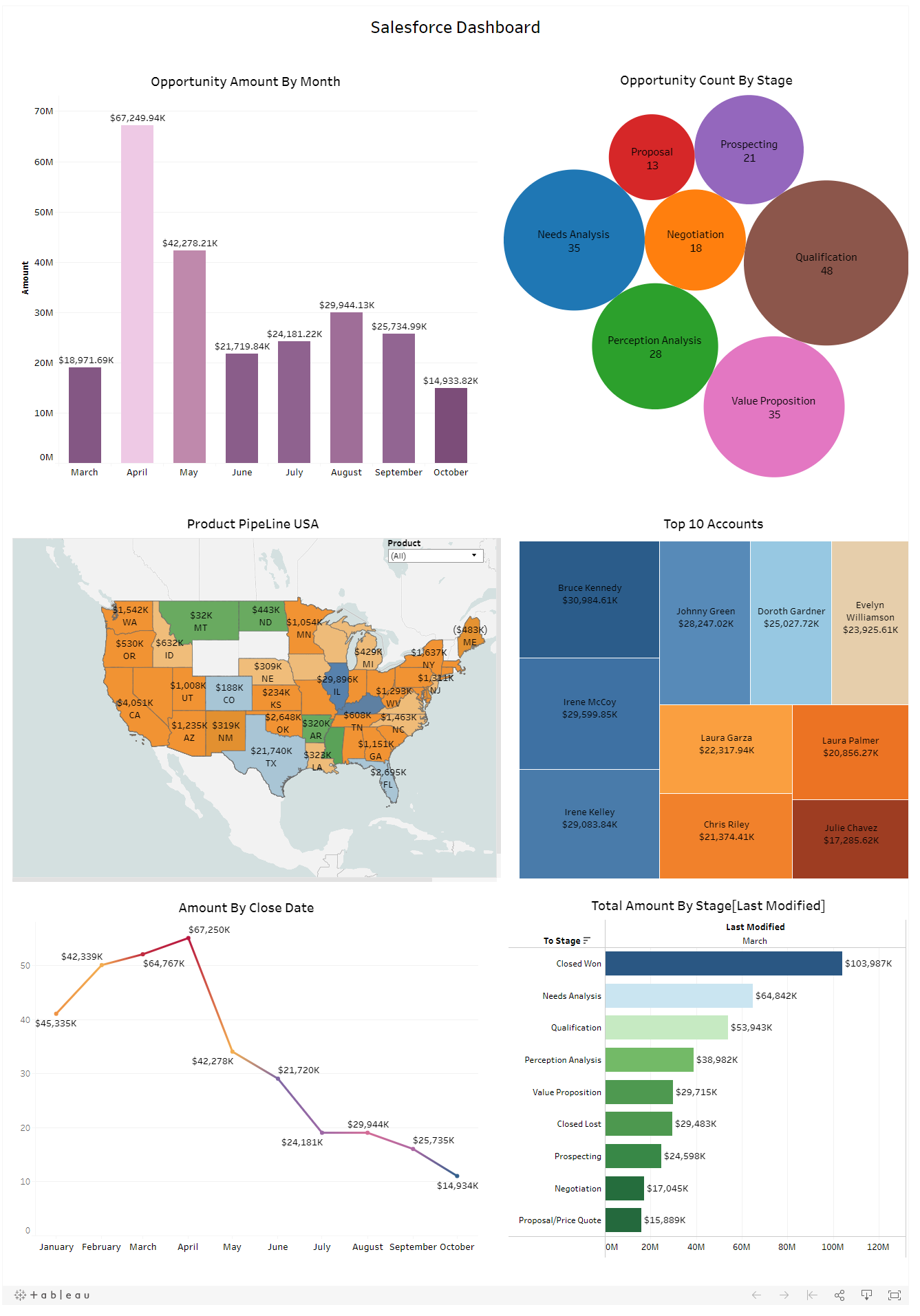
Tableau dashboards are also widely used to analyze digital advertising campaign performance. Businesses often track metrics such as impressions, clicks, cost per click (CPC), and conversions to measure the effectiveness of their online advertising strategies. By visualizing advertising data in Tableau, marketing teams can quickly identify trends and optimize campaigns.
Summary:
Organizations often combine Salesforce CRM data with website analytics data o gain deeper insights into customer behavior and marketing performance. Tableau makes it possible to visualize website traffic, user engagement, and conversion metrics alongside sales data. This integration helps businesses understand how marketing efforts influence customer acquisition and revenue.
Tableau continues to be a powerful business intelligence platform that enables organizations to transform complex datasets into clear and actionable insights. From CRM analytics and marketing dashboards to operational reporting and customer service performance tracking, Tableau supports data-driven decision making across industries. To explore more Tableau dashboards, analytics solutions, and real-world use cases, visit our Tableau Analytics Expertise page.
For any query on Tableau Salesforce Dashboard, contact support@astreait.com